What language steers AI image generation
An image prompt isn't one slider — it's 38 knobs in four orthogonal systems. Some pick the aesthetic world (which medium, era, palette, light). Some set the boldness (how far from the safe, "AI-default" mean). Some decide whether it renders and builds at all. And some assemble the page. This is the map — with real, measured examples for Redwood Pizzeria.
Each axis has a short code. The letter is its topic family: A = the medium / visual family (A1 medium, A3 world, A5 palette, A6 atmosphere, A7 lighting…); B = boldness primitives (B1 composition, B5 the dial…); S = structural-craft, i.e. will it render & build (S4 font…); M = mock-only, i.e. page layout (M1 information architecture…). L1–L5 = the five levels of the SAFE↔BOLD dial (L1 conventional → L5 disruptive). A3's sub-families: A3a movements, A3b reference-worlds, A3c contemporary-digital.
One wrinkle: the letter is a topic, not a perfect group label. Two A-coded axes — A2 (medium artifacts: halftone, misregistration) and A4 (ink drench) — actually steer boldness, so they appear in the Boldness section, not the aesthetic samplers. That's why the aesthetic axes run A1 → A3 → A5 (A2 and A4 live under Boldness).
The core idea
The single most useful move is to separate which world a design lives in from how bold it is. They're independent: a risograph can be quiet or loud; "loud" can be expressed in any medium. Keeping them apart is what turns a vague brief into a set of dials you can actually turn.
Medium, era, reference-world, palette, lighting, focal subject. Swapping a value changes the design's identity, not its loudness. "Risograph" and "linocut" are equally bold — different worlds.
Artifact density, ink coverage, composition risk, the safe↔bold dial. Turning these up departs from the airy, mediumless, centered "AI-default" — without changing which world you chose.
Two more systems support these: structural-craft (the phrasing mechanics that make a value actually render and stay buildable) and mock-only (the extra axes a full-page layout adds). Build-safety always sits below the dial — no boldness level may break legibility, font-overflow, or the page's structure.
What we mean by "style"
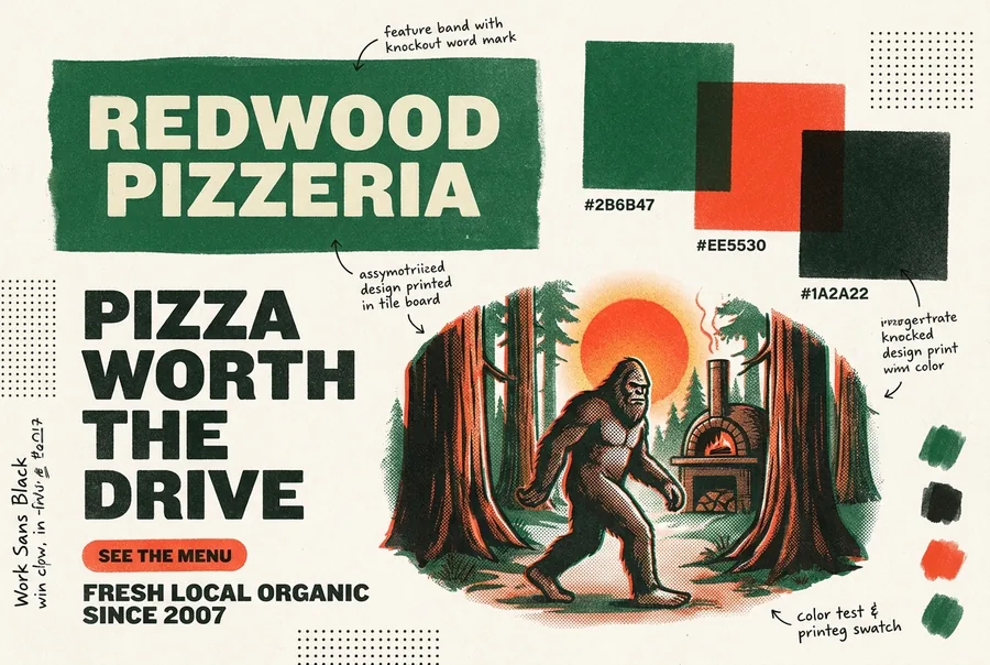
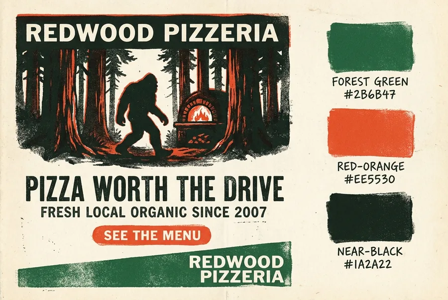
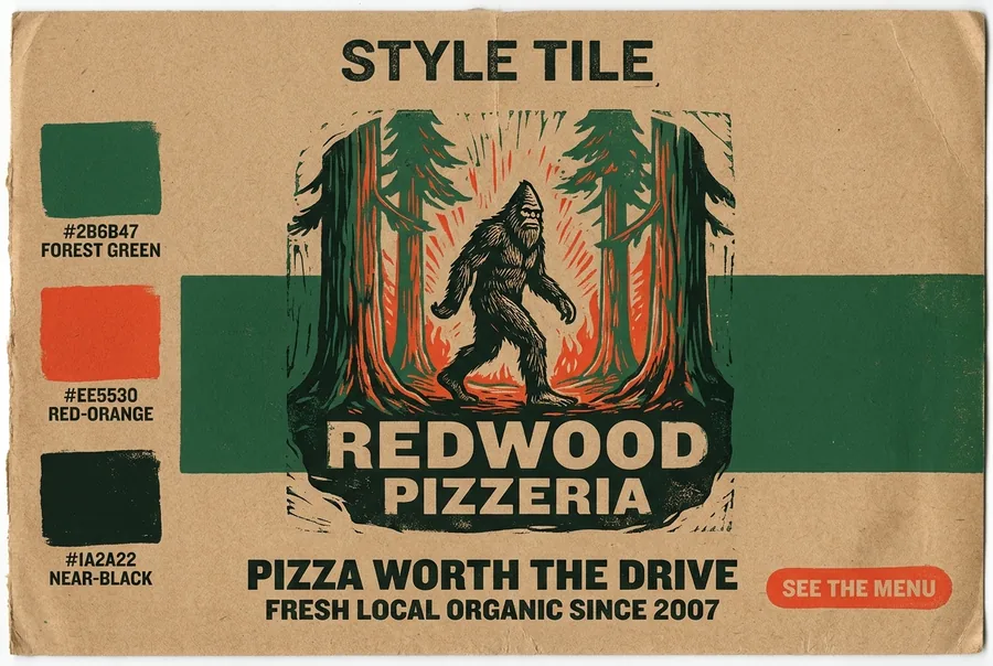
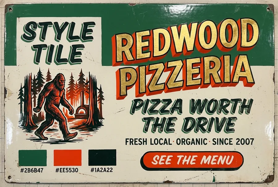
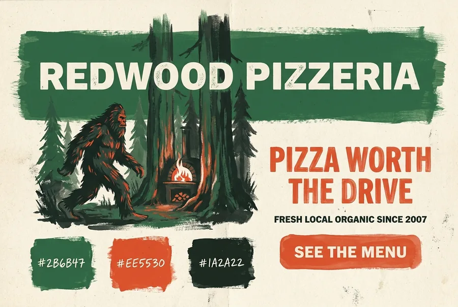
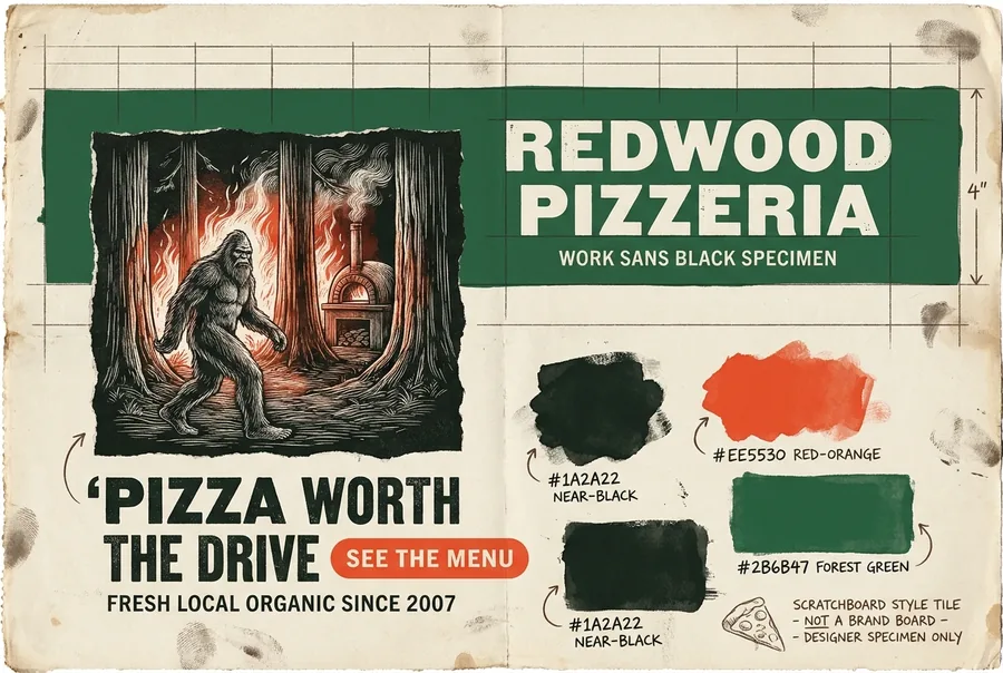
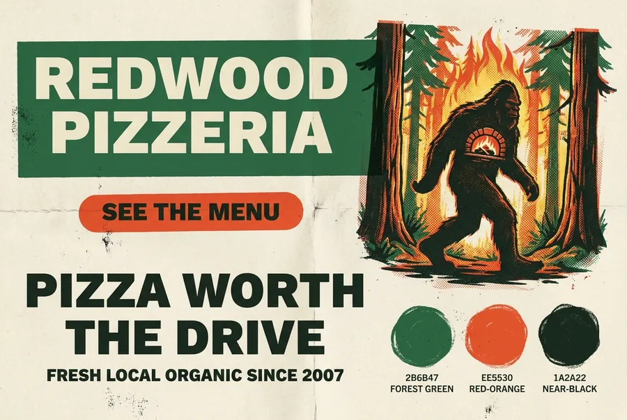
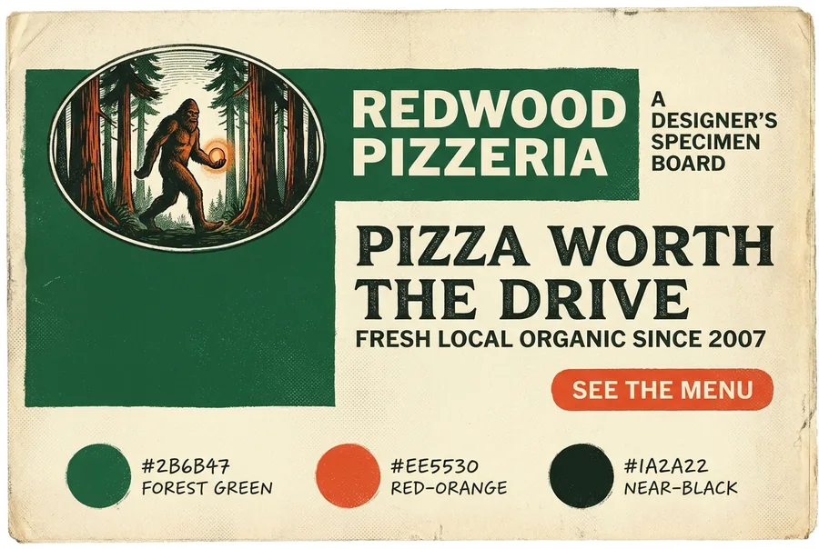
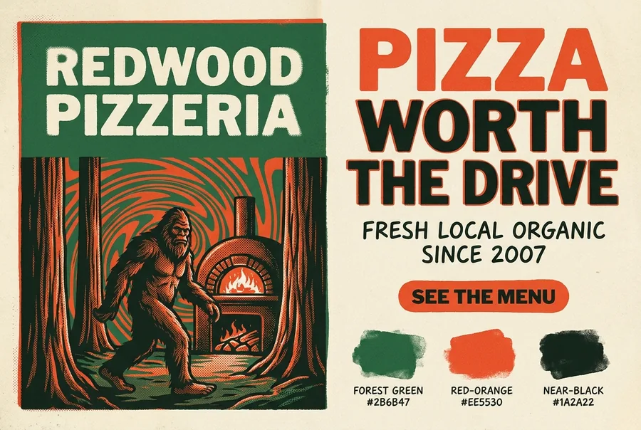
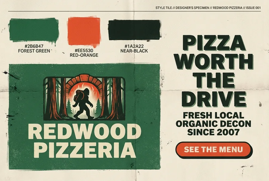
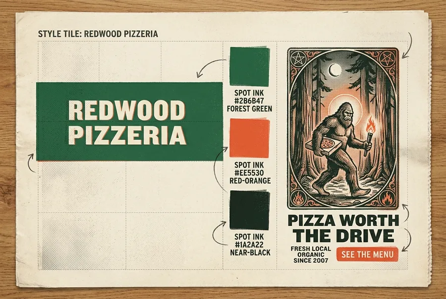
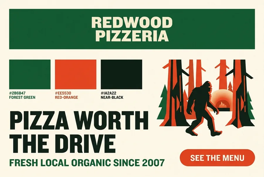
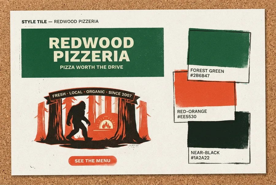
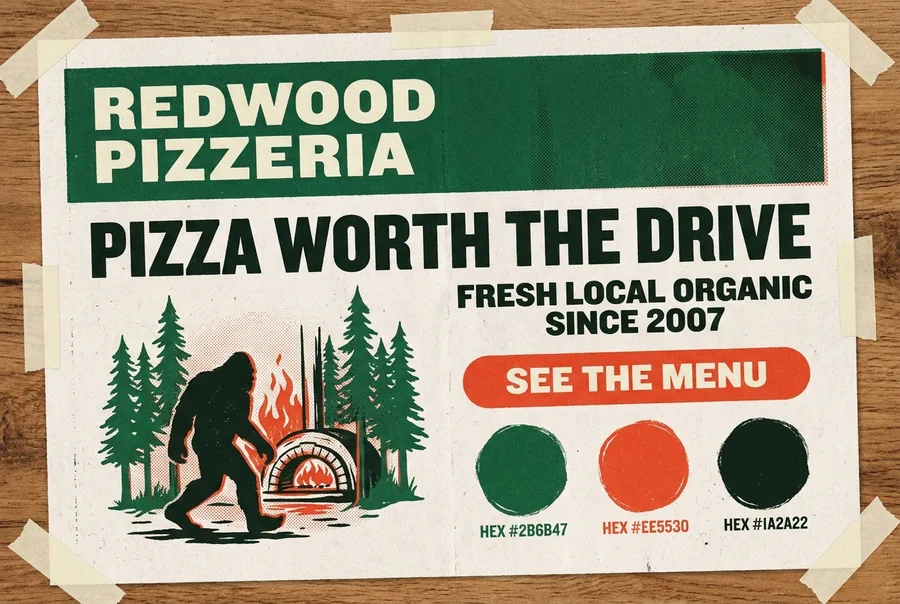
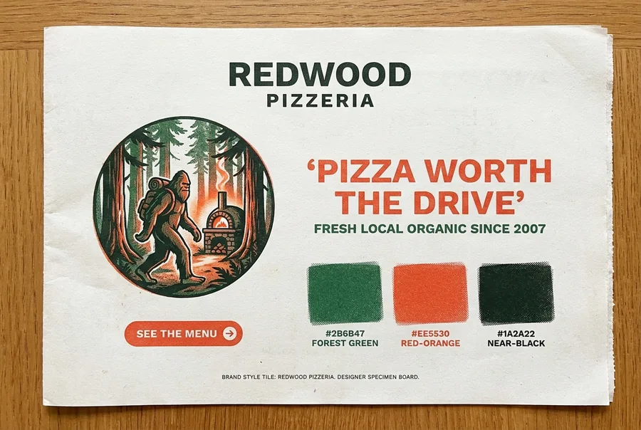
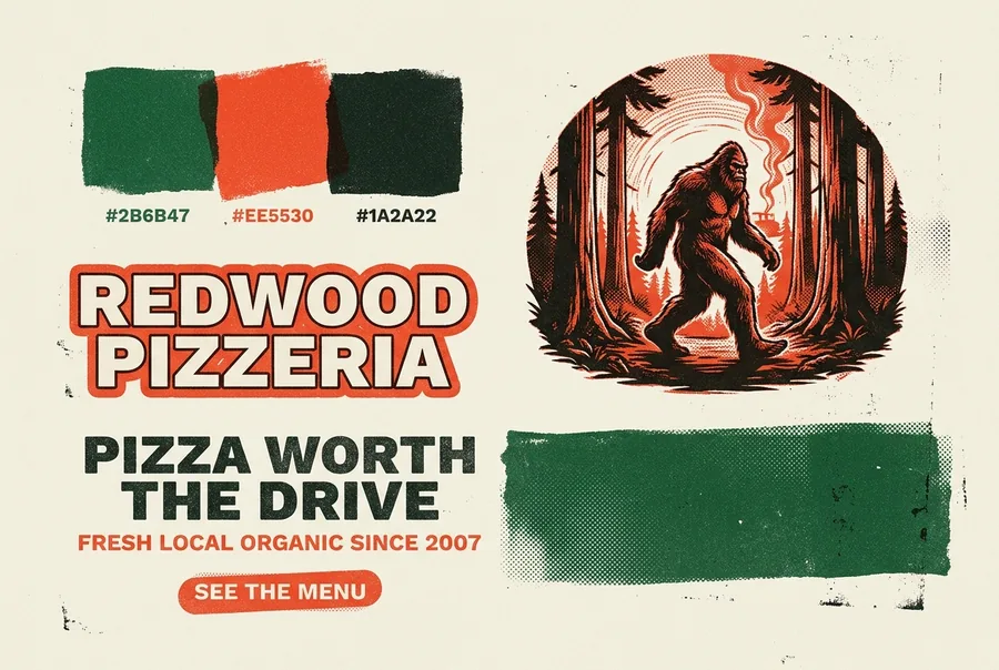
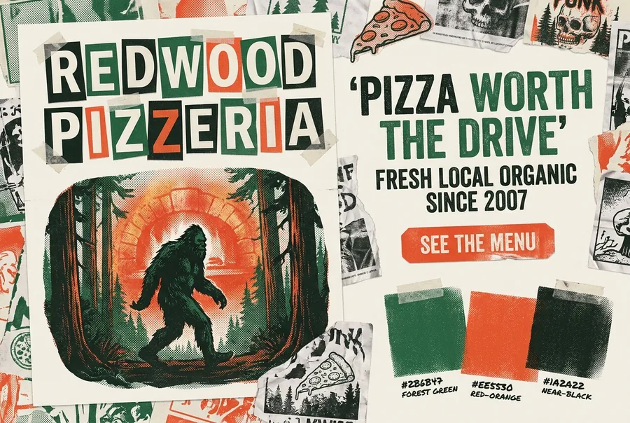
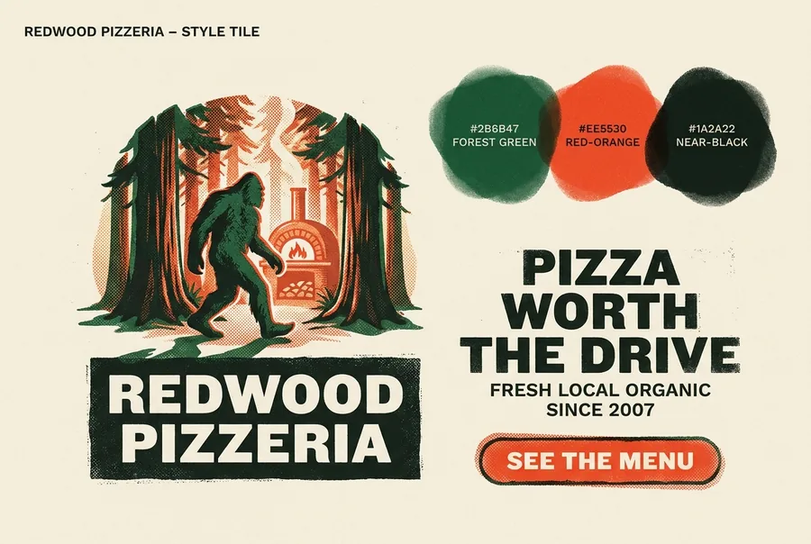
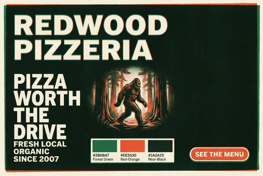
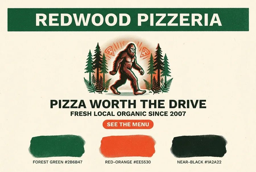
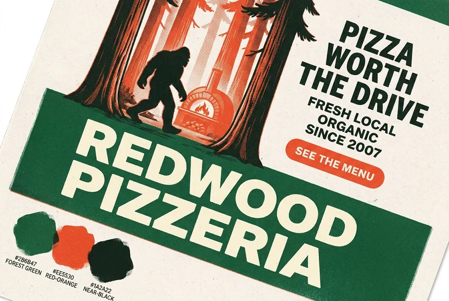
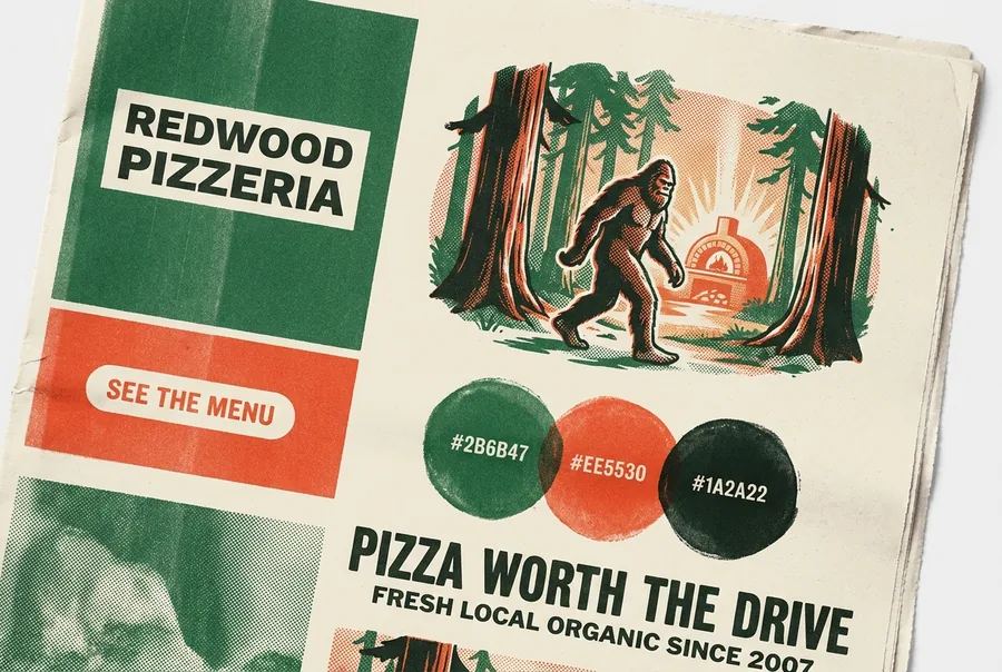
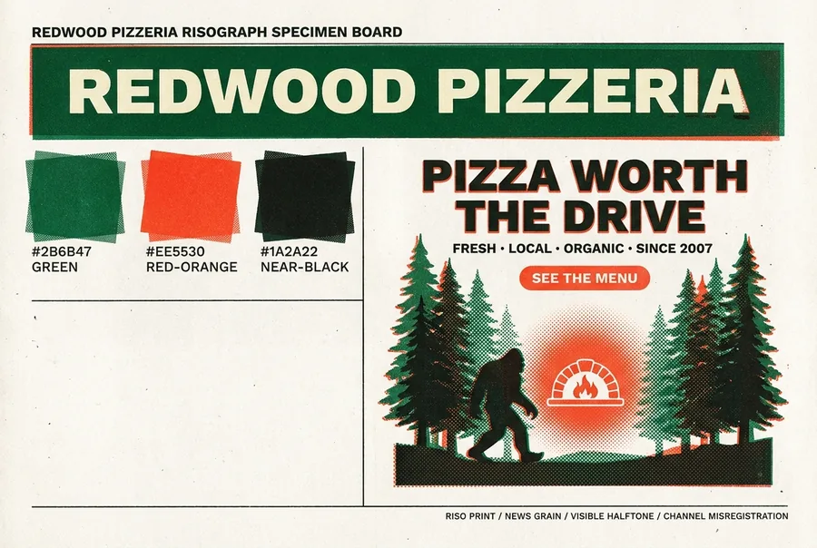
When people say "style" they usually mean all three at once. We split them into medium (how it's made), world (the aesthetic universe), and posture (the brand's personality) — so you can cross any medium with any world (18 mediums × 43 worlds ≈ 770 combinations) and set the posture on top. Below: the same Redwood content, only the style dimension changed. Naming an opinionated medium is the highest-leverage lever — the primary escape from the generic default.


Full A1 catalog (18): risograph · silkscreen · linocut · woodblock · letterpress/wood-type · offset litho · Ben-Day comic · cyanotype · scratchboard · xerox-zine · gouache · watercolor · editorial photo · 35mm film · cut-paper collage · and 3 finishes (gold-leaf · ceramic tile · embroidered patch — badge-only, ship as a fixed asset).


Full A3 catalog (now 43 values, expanded run-019) is organized into three sub-families: A3a design movements (Swiss · Bauhaus · Art Deco · Pop Art · Brutalism · Constructivism · Memphis · Minimalism · Maximalism · psychedelic · vaporwave…), A3b reference worlds (WPA · tiki · tarot · Kitsch · alpine-lodge · botanical · Western · diner · storybook · field-guide…), and A3c contemporary digital/UI (clean SaaS · editorial-minimal · soft-organic-modern · neo-brutalist-web · glassmorphism · gradient-mesh…). The ★ low-boldness entries (Minimalism · Bauhaus · clean-SaaS · editorial-minimal · soft-organic-modern · alpine-lodge · botanical) are the deliberately less-risky palette.
The third dimension. Posture is the stance behind the design — the brand archetype it plays. It's subtler than medium or world: it shifts tone and character, and it guides which medium, world, and boldness level even fit. Same brand + medium (silkscreen) below — only the personality changes:
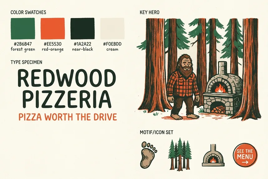
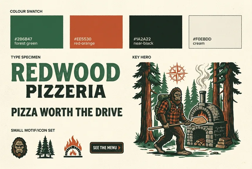
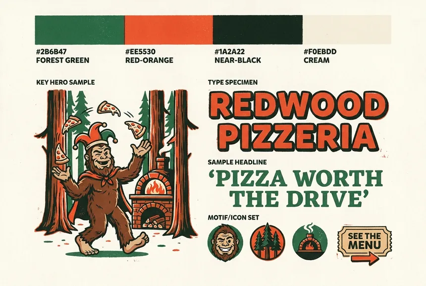
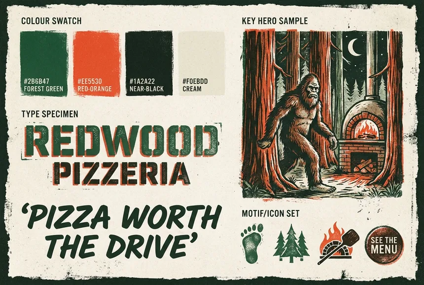
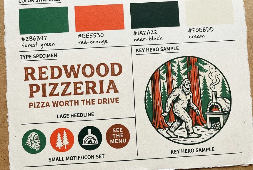
The five archetypes (condensed from the classic brand-archetype set): Caregiver/Everyman · Explorer/Hero · Jester/Magician · Outlaw/Rebel · Sage/Creator. In the taxonomy posture is a strategy layer — it sets which medium/world/boldness are defensible — so, unlike medium and world, it doesn't go directly into the image prompt; here it's translated into visual cues so you can see its effect.
The map
Medium, era/world, palette, atmosphere, lighting, focal subject, color-harmony, grain.
Artifact density, ink coverage, composition risk, wordmark treatment, category-code stance, ornament. Plus the L1–L5 dial and the intensifier proxy.
Token order, hex precision, specimen-anchored fonts, font-tier safety, negatives, prompt length, no-seeds.
Section IA, layout variety, cross-section bleed, mid-page density, recurring character, framing, single-column, greeking.
Outside the grid: the L1–L5 dial and the intensifier adverb are presets over the boldness primitives (turn the dial or the primitives, not both). And B8 brand archetype is a strategy layer that sets which dial level is defensible — it never enters the prompt.
Aesthetic axes
Eight knobs that set identity. A1 and A3 are shown above; the rest:
Exact HEX + a spot-ink count, never colour words ("warm earthy" averages to safe neutral).
The hero subject & mood baked into the board.
How it's lit, independent of scene — carries a contrast/legibility consequence (keep bright elements out of the text band).
What the eye lands on first; single-hero reads boldest.
The relationship between hues (distinct from A5's exact hexes).
Generic texture not tied to a named press. "Clean / no texture" is itself a safe-tell.
Boldness axes · MEASURED
We swept five boldness axes one-at-a-time (50 images, content held fixed) and measured each. The finding: concrete nouns steer; abstract adverbs don't.
The proof-of-medium nouns. Climbs cleanly and stays legible at every step — the validated primary boldness lever.


safe ——————————————▶ bold
A preset that moves several primitives together — the widest safe→bold distance in the library.


L1 ——————————————▶ L5
Coverage pushes loudness, but past a point it costs legibility (drowns the type & swatches). Not a clean dial — split it into extent + a legibility guardrail.


Strong endpoints (centered → full-bleed crop), but the middle rungs are too close together to be distinct steps.


"subtle → bold → extreme" with nothing concrete attached. Measured: Flash net −1.5, and a blind test recovered the order at chance (0.50) vs A2's 0.65. The word alone moves nothing — the model has nothing concrete to dial.


Name the medium and its physical artifacts (risograph + halftone + misregistration + ink-bleed); flood a feature band; break the grid. Those are concrete and they steer. "Make it bolder / more dramatic / edgy" is a confirmed dud — an abstract adverb gives the model nothing to dial. Other boldness axes: B2 wordmark treatment, B3 category-code stance, B4 ornament density, B6 targeted negatives.
Support systems
| Axis | What it does |
|---|---|
| S1 order | medium-first, negatives last |
| S2 grain | artifact-NOUN beats style-LABEL |
| S3 framing | "a Style Tile", not "a brand board" |
| S4 font | specimen-anchored, SAFE-tier OR fixed SVG |
| S5 type-in-use | real headline + CTA, not a font label |
| S6 specimen | "matching an authentic <Font> specimen" |
| S7 negatives | reframe as positives; few & targeted |
| S8 length | <~400 words; verbose degrades font fidelity |
| S9 no-seeds | branch for direction; re-roll only defects |
| S10 body type | body face + pairing, SAFE-tier |
| S11 case | all-caps / sentence — declare in both prompt + HTML |
| Axis | What it does |
|---|---|
| M1 IA | the enumerated page spine |
| M2 variety | defeat the stacked-equal-band default |
| M3 bleed | an object crosses the section cut |
| M4 density | keep a feature band dense past the hero |
| M5 character | recurring mascot across sections |
| M6 frame | register-driven framing device |
| M7 column | held ON — fights the 2-column default |
| M8 greeking | held ON — "soft gray smudged lines" |
| M9 anti-chrome | held ON — no fake browser/URL bar |
The font-tier coupling matters most here: a medium like letterpress/woodblock biases the baked letterform toward overflow-prone display type — down-spec to a SAFE slab or ship the logo as a fixed SVG.
Putting it together
Set the dial once (it bundles the boldness primitives), then explicitly name the medium + 1–3 artifacts + exact palette + a SAFE-tier wordmark. Pick one world and one scene. That's the whole prompt — don't turn every boldness axis by hand, and don't over-describe.
A risograph brand Style Tile for REDWOOD PIZZERIA. Visible halftone, channel misregistration, soft grain. 3 spot inks #2B6B47 forest, #EE5530 red-orange, #1A2A22 ink on #F0EBDD newsprint. Wordmark REDWOOD PIZZERIA in Work Sans Black, matching an authentic Work Sans specimen, all caps, cream knockout with a hard red-orange misregistered offset. Type in use: headline 'PIZZA WORTH THE DRIVE' + a red-orange 'SEE THE MENU' pill. Bigfoot-in-redwoods vignette. Asymmetric, one element breaks its container. No clean vector, no symmetric swatch grid.
Every coloured fragment maps to an axis: medium (A1) · artifacts (A2) · palette (A5) · font (S4/S6) · treatment (B2) · composition (B1) · negatives (B6). Swap the medium and you get a different world; raise the artifacts/drench and you climb the dial.